The Psychology of Colour and Your Business
According to Martin Christie of Logo Design, London; “Understanding the psychology of colours is vital to designing an effective logo.” In fact, choosing the right colours for your business and subsequent forms of advertising are essential. The aesthetic of your product and its labeling can have a huge impact on sales.

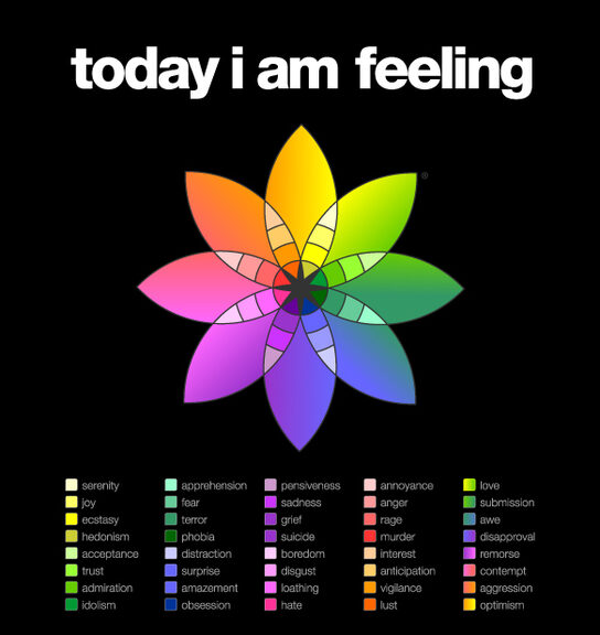
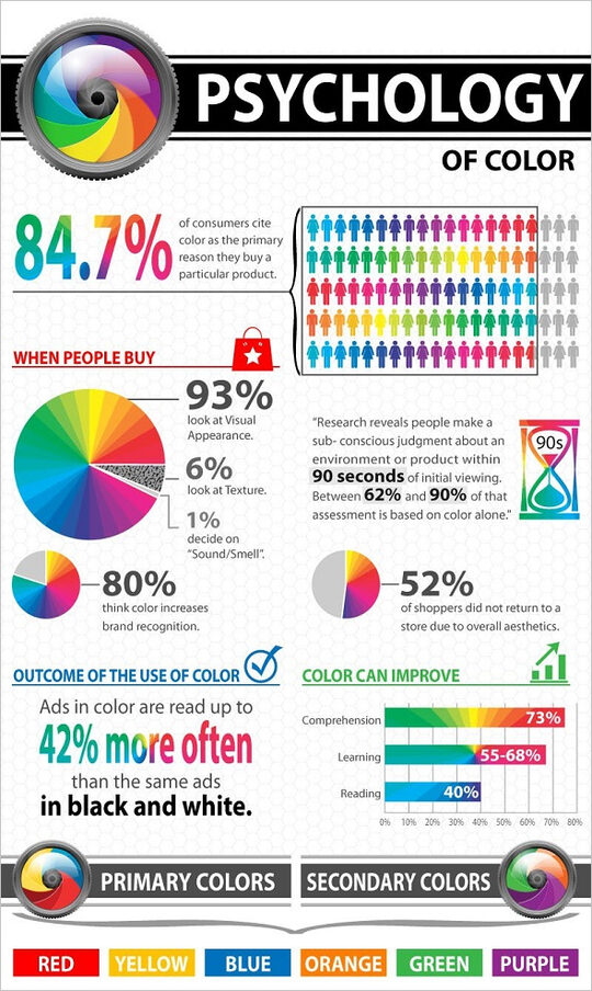
Eric Markowitz writes,” Research has shown that color influences our emotions in a variety of ways, but perhaps most importantly, it's the first sensory touch point with a customer or client.” "The first point of interaction is shaped by the color, and color is the most memorable sense," says Leslie Harrington, the executive director of The Color Association and a color consultant. "Before anything else, they see color."

Case studies have shown that a consumer's decision to purchase products can range from anywhere between 60 and 80 percent based on the product's color. Color has the unique ability to make or break the success of a product, Harrington notes. "It doesn't cost you any more to make the right color decision for your product. But if you choose the wrong color, from the onset, you're not going to communicate what you want to your customer.' In other words, if you get it wrong, it can really impact the overall performance of your company.
Every colour, including black and white, has implications for logo design. As designers, you need to pick your colours carefully to enhance specific elements of the logo and bring nuance to your message with the use of shade and tone.
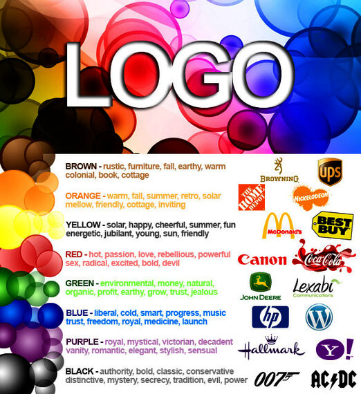
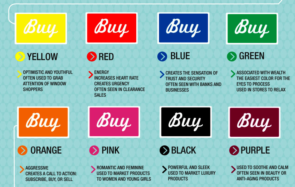
In general terms, bright and bold colours are attention-grabbing but can appear brash. Muted tones convey a more sophisticated image, but run the risk of being overlooked. More specifically, particular meanings are ascribed to different colours in society...

But be careful about what you choose, according to Pamela Wilson, “Your brand colors have a powerful impact on how your customers perceive your business. Adding color to your web-based marketing materials doesn’t cost anything. The only cost? The time it takes you to decide what color to add. Maybe that’s why so many people go overboard with color. Rather than develop a recognizable set of colors that people will associate with their brand, they add color with no restraint at all. They dilute color’s power. Minimize your colors for maximum impact.”
Choose two main colors to start. Color works best when used sparingly and consistently. To start, pick two main colors to represent your business and your brand.
Here are things thought about several colours:
Black Sophisticated. Luxurious. Formality. Style. Elegance. Expensive. Authoritative.
Brown Organic, Wholesome, Simple & Honest
Green The fresh start of spring brings waves of Green and with it comes attributes of youth, sentimentality, nature, adventure, growth and health.
Navy A masculine color associated with depth, expertise, and stability. It’s a preferred color for corporate America.
Orange Orange represents enthusiasm, fascination, happiness, creativity, determination, attraction, success, encouragement, and stimulation.
Purple power, royalty, nobility, elegance, sophistication, artificial, luxury, mystery, royalty, elegance, magic
Red Red is the color of energy, passion, action, ambition and determination. It is also the color of anger and sexual passion.
White Purity, Cleanliness
Yellow Joy, optimism, happiness, danger, sunshine, idealism, imagination, hope, summer, gold, deceit, philosophy, dishonesty, cowardice, betrayal, jealousy, disease and warning.


